Ребята, помогите сверстать

49 повідомлень
#17 років тому
Мне нужно сверстать на слоях. Чтобы левый, правый, центральный блок прижимался к низу. Например если правый блок имеет больше текста то и все блоки имеют такую высоту, ну и наоборот. можно и без подвала. Заранее спасибо.

2195 повідомлень
49 повідомлень
#17 років тому
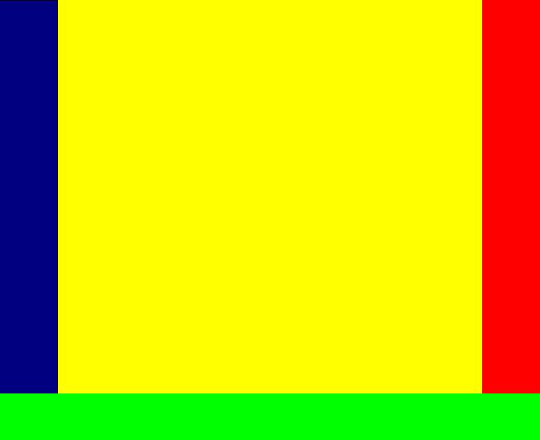
Цитата ("Sir_Michael"):Существует около50100 способов верстки трех колонок, в том числе с одинаковой высотой.
Пример: ]http://matthewjamestaylor.com/blog/ultimate-3-column-holy-grail-pixels.htm
Очень плохо что не по высоте растгиваеться на 100% (((
2195 повідомлень
49 повідомлень
#17 років тому
Цитата ("Sir_Michael"):Цитата:не по высоте растгиваеться на 100% (((
чего?
я имею виду что по высоте не очет растягиваться на 100%.
<?xml version="1.0" encoding="utf-8"?>
<!DOCTYPE html PUBLIC "-//W3C//DTD XHTML 1.0 Strict//EN" "http://www.w3.org/TR/xhtml1/DTD/xhtml1-strict.dtd">
<html xmlns="http://www.w3.org/1999/xhtml" xmlns:v="urn:schemas-microsoft-com:vml" >
<head>
<title>The Holy Grail 3 column Liquid Layout. Pixel widths. Cross-Browser. Equal Height Columns.</title>
<meta http-equiv="Content-Type" content="application/xhtml+xml; charset=utf-8" />
<meta name="description" content="The Holy Grail 3 column Liquid Layout. Pixel widths. Cross-Browser. Equal Height Columns." />
<meta name="keywords" content="The Holy Grail 3 column Liquid Layout. Pixel widths. Cross-Browser. Equal Height Columns." />
<meta name="robots" content="index, follow" />
<link rel="shortcut icon" href="/favicon.ico" type="image/x-icon" />
<style media="screen" type="text/css">
/* <!-- */
/* General styles */
body {
margin:0;
padding:0;
border:0; /* This removes the border around the viewport in old versions of IE */
width:100%;
background:#fff;
min-width:600px; /* Minimum width of layout - remove line if not required */
/* The min-width property does not work in old versions of Internet Explorer */
font-size:90%;
}
a {
color:#369;
}
a:hover {
color:#fff;
background:#369;
text-decoration:none;
}
h1, h2, h3 {
margin:.8em 0 .2em 0;
padding:0;
}
p {
margin:.4em 0 .8em 0;
padding:0;
}
img {
margin:10px 0 5px;
}
/* Header styles */
/* 'widths' sub menu */
#layoutdims {
clear:both;
background:#eee;
border-top:4px solid #000;
margin:0;
padding:6px 15px !important;
text-align:right;
}
/* column container */
.colmask {
position:relative; /* This fixes the IE7 overflow hidden bug and stops the layout jumping out of place */
clear:both;
float:left;
width:100%; /* width of whole page */
overflow:hidden; /* This chops off any overhanging divs */
}
/* holy grail 3 column settings */
.holygrail {
background:#ff9;
/* Right column background colour */
}
.holygrail .colmid {
float:left;
width:200%;
margin-left:-200px; /* Width of right column */
position:relative;
right:100%;
background:#009900; /* Centre column background colour */
}
.holygrail .colleft {
float:left;
width:100%;
margin-left:-50%;
position:relative;
left:400px; /* Left column width + right column width */
background:#FFD8B7; /* Left column background colour */
}
.holygrail .col1wrap {
float:left;
width:50%;
position:relative;
right:200px; /* Width of left column */
padding-bottom:1em; /* Centre column bottom padding. Leave it out if it's zero */
}
.holygrail .col1 {
margin:0 215px; /* Centre column side padding:
Left padding = left column width + centre column left padding width
Right padding = right column width + centre column right padding width */
position:relative;
left:200%;
overflow:hidden;
}
.holygrail .col2 {
float:left;
float:right; /* This overrides the float:left above */
width:170px; /* Width of left column content (left column width minus left and right padding) */
position:relative;
right:15px; /* Width of the left-had side padding on the left column */
}
.holygrail .col3 {
float:left;
float:right; /* This overrides the float:left above */
width:170px; /* Width of right column content (right column width minus left and right padding) */
margin-right:45px; /* Width of right column right-hand padding + left column left and right padding */
position:relative;
left:50%;
}
/* Footer styles */
/* --> */
</style>
<!-->
<style media="screen" type="text/css">
.col1 {
width:100%;
}
</style>
<!-->
</head>
<body>
<div class="colmask holygrail">
<div class="colmid">
<div class="colleft">
<div class="col1wrap">
<div class="col1">
<!-- Column 1 start -->
1
<!-- Column 1 end -->
</div>
</div>
<div class="col2">
<!-- Column 2 start -->
2
<!-- Column 2 end -->
</div>
<div class="col3">
<!-- Column 3 start -->
3
<!-- Column 3 end -->
</div>
</div>
</div>
</div>
</body>
</html>
2195 повідомлень
#17 років тому
Вообще я считаю, что вытягивать по высоте экрана в подавляющем большинстве случаев - лишнее.Обычно достаточно задать какой-либо min-height (как сделать чтобы работало в IE6 - в гугл!) контентной части.
Если же вытягивание на высоту экрана ну прямо очень надо - посилання и также посилання